 Details
A lot of native advertising sucks. Here’s how not to.
At the Native Advertising Institute, we see a lot of really good native advertising. But as an organisation that spends a lot of time thinking about the state of the industry, we've also come to the – unfortunately, rather obvious – conclusion that a lot of it is bad. As in, really bad.
Spend a few days browsing through some of the native advertising you can find online, and you will almost certainly reach the same conclusion.
Quite often it seems that a gifted media salesperson must have convinced a hapless company that “sure, you have an incredible story to tell” and then once the sale has been finalized the advertiser receives no support and creative guidance and the output becomes something like the ad below.
An example of bad native advertising
This is a laughably inadequate piece of content. Downright comical.
The angle is why car races are popular, which I guess is something you can write about. But the context (the story is posted on an English-language news site in Denmark) is confusing, to say the least.
It is also not clear who the advertiser is, although the article does include two links to a betting site. This indicates that perhaps the ambition here is not good content, but rather link building.
If we maintain that native advertising is supposed to mimic the quality of editorial articles (or videos), then this one fails.
But it’s easy to be critical, isn’t it? Rather than just pile on the criticism, let’s instead talk about how to make good native advertising. I’ve made a checklist of five simple traits that your native advertising should have before you put it in front of an audience.
A caveat before we dive in: these are solely based on my own opinion as a content creator. They merely reflect my own experience as somebody who has produced native advertising, worked with both clients and media outlets and overseen the production of a lot of native advertising campaigns, both good and bad.
With that said, let’s get it on. Here are the five traits that separate the good native advertising from the bad.
READ MORE: Here are the different types of native ads available
So what does good native advertising look like?
1. A good story that fits the publisher
As a good starting point, you should ask yourself whether there is any chance that the media where you plan to place your native advertising would publish a similar story if you weren’t paying them.
Native advertisers should always take a long hard look at the content they are about to publish. They should ask themselves: Would anybody browsing this website – a website that is filled with exciting editorial content – actually want to click on our article?
To think about it another way, ask yourself whether the publication would consider running a story about your topic if they received a press release about it. If you're not sure, you could try reaching out to the publisher and asking for their editorial guidelines or any audience research they are willing to share.
If the answer is no, you should probably reconsider the story or the match between brand and publisher. If the answer is yes, then you have a quality story to work with and you can go from there.
RELATED: The 12 best native advertising examples in 2024
Good example:
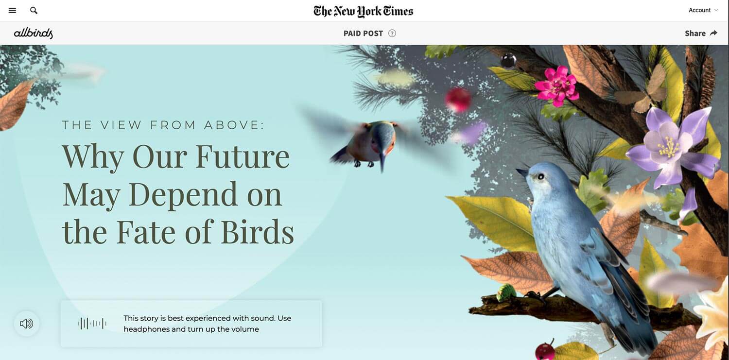
The New York Times is highly respected for its science and climate coverage, which makes this match between native content and audience ideal. It's also beautifully presented, ticking another trait off my personal checklist (see point 5 below).
Bad example:
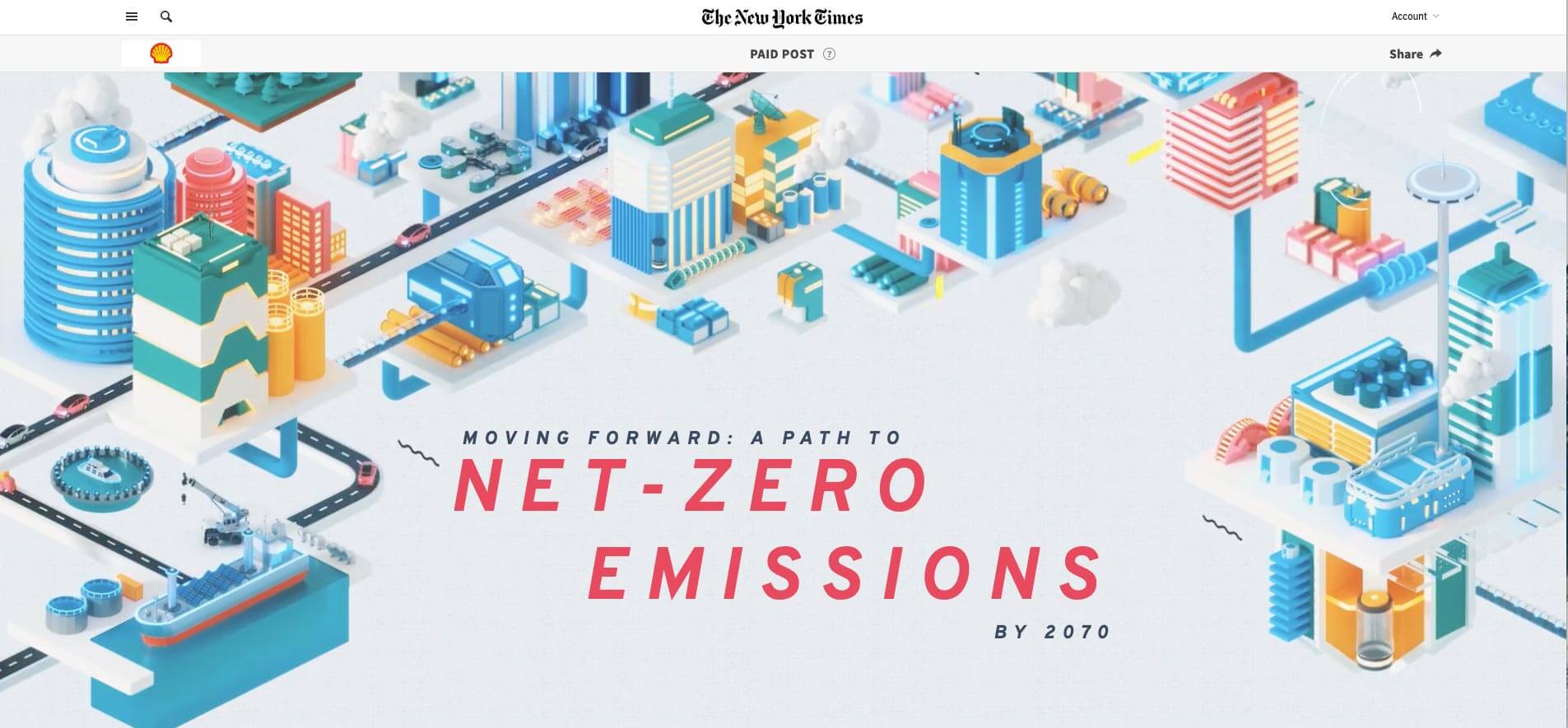
This story is also beautifully presented, no doubt about it. But would the New York Times ever choose to present this story so elaborately if it weren't being paid handsomely by Shell? Of course not. In fact, I don’t think the Times would run the story at all if it had merely received a press release from Shell that said “here’s what our company thinks the energy supply of tomorrow should look like”.
2. A good headline
This isn’t as deep into “well, duh” territory as you may think.
There are a lot of really bad sponsored content headlines out there. Headlines that enforce the notion that sponsored content is second-rate.
It should be the other way around: Native advertising needs exceptional headlines – headlines that are at least as potent and punchy as editorial headlines – to guarantee that the audience won’t dismiss the content just because of the ‘sponsored’ label.
Good example:
The headline 'Philadelphia's Violent Attack on a Black Radical Group' definitely makes me want to learn more.
Bad example:
The headline 'John Mayer Goes Outside', on the other hand, seems to reveal that there’s not a whole lot at stake here. To be fair, it does match the tongue-in-cheek vibe of the whole campaign, but how many readers will get past the dull headline to discover that?
READ MORE: How to write headlines for native ads
3. Interesting sources
Sponsored content that is based on quotes from the advertiser’s own employees is utterly uninspiring if not downright lazy. It’s a press release disguised as an article.
Talking to people should be the plight of content in a journalistic setting. You talk to people to learn more about a subject or to bring an interesting perspective to a story.
Finding sources for sponsored content can be difficult. It is certainly trickier than finding sources for an editorial production. But interesting, external sources help separate the good native from the bad.
Reach out to sources outside of your organization. Be forthright and explain what your company is trying to do with this piece of content, but also explain what the source can achieve: a platform to share their knowledge or point of view with a large audience. Sponsored content or not, that opportunity is something many sources will value.
Good example:
Perhaps the most impressive element of this fabled piece of native advertising is the pool of interesting external sources who enlighten readers about the subject. We hear from a psychologist, activists, a prison warden and several former prisoners, to name just a few.
This wide breadth of knowledgeable sources is an overlooked reason why the article ‘Women Inmates: Why the Male Model Doesn’t Work’ is still often held up as an example of sponsored content done extremely well.
Bad example:
There’s nothing egregious about this article, it’s just really dull that the only interviewee is the CEO of the advertiser.
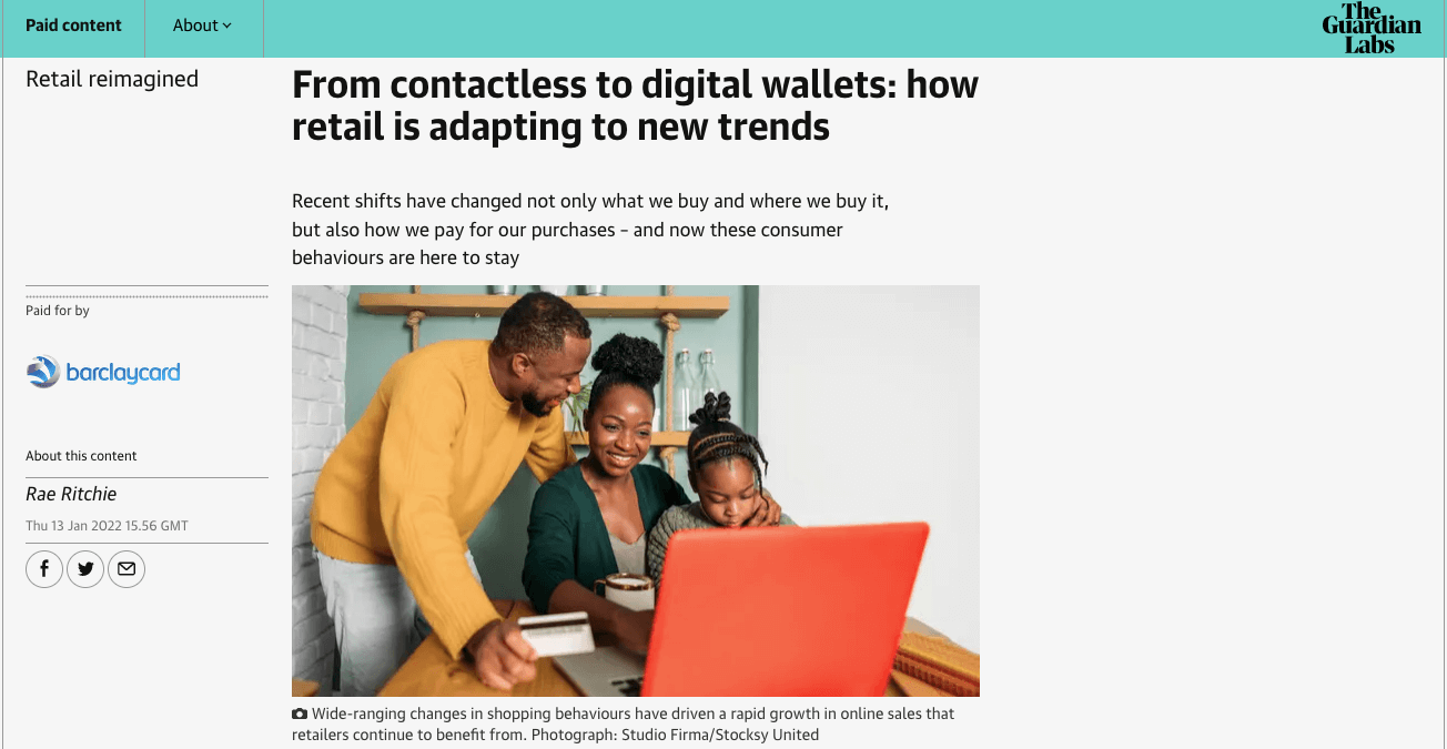
4. Elements of “objective storytelling”
What I mean by “objective storytelling” is that native advertisers should aim to achieve more than just merely talking to themselves about themselves.
There should be a willingness to engage with relevant issues and present facts and information that do more than talk up the advertiser’s products.
This is not to say that native advertising always needs to be about serious societal issues. Of course not. However, native advertising should strive to tell the best possible story. Even if it includes mentioning facts, or even competing brands, that don’t necessarily forward the advertiser’s agenda.
Otherwise, well, it’s boring. You might as well go with a banner ad.
Good Example
..png)
Bad Example
This, in contrast, is basically just a product guide from the advertiser.

5. Interesting visuals
I'm not going to artificially pad my word count here. This speaks for itself.
Good example:
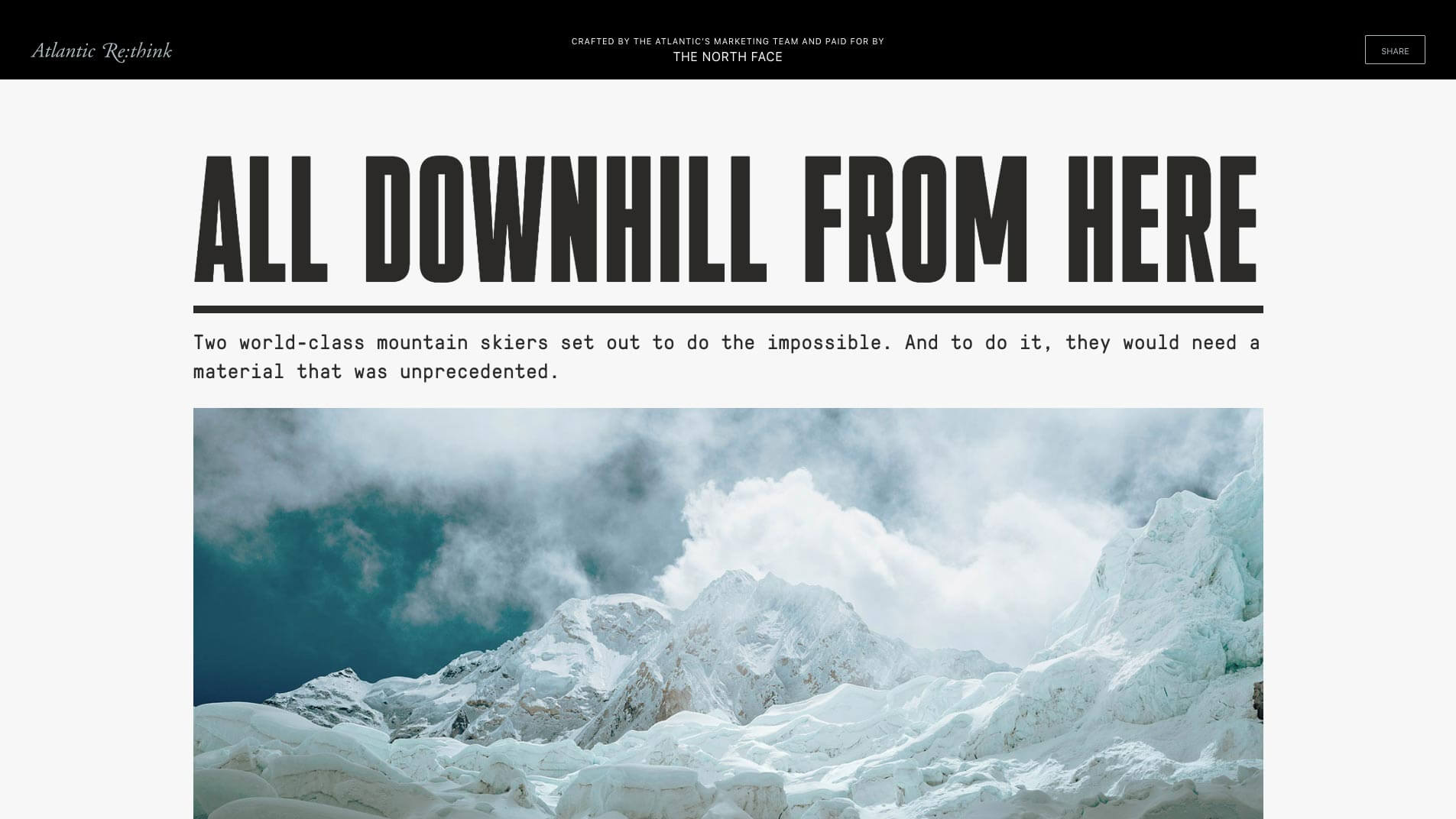
This collaboration between The Atlantic and North Face is filled with stunning visuals. Real quality work – go check it out.
Your takeaways
In conclusion, these are the five ways tell good native advertising apart from the bad native advertising:
- A good story that fits the specific audience
- An enticing headline
- External sources, not just a litany of quotes from your CEO
- Talking about something besides yourself
- Having good visuals that add to the story
Of course, this is just one man’s opinion. If you want other (and perhaps smarter) takes on what makes for good native advertising, you should subscribe to the NAI newsletter.
