 Details
The truth is, the way your native ad looks matters...a lot. Here are 8 visual techniques for advertising you can use when creating visual ads, including native ads.
When it comes to visual advertising techniques, images are much more evocative and easy to remember than text is. Our cognitive processes work better with images. We work fast to associate them with memories, knowledge, and beliefs. In other words, people are much easier to convince through imagery.
It’s no wonder, then, that commercial photography has high standards and not just with regard to image quality. Using visual techniques for advertising is a way of controlling not only the message the ad conveys, but also where the viewer will look first, the path of one's gaze, the emotion of the viewer, one's mental connections, and much more. You'll never believe how powerful vertical lines are in an ad, for example.
Visual techniques in advertising are based on several visual composition techniques usually used in photography. The difference is that in advertising these elements build up the entire message in a complex and straightforward composition.
If photographers think of the truth and how to convey it, advertisers think only of how to convince the public that their story is true and their product is the best. Here are some visual techniques absolutely necessary if you want to work in native advertising or any kind of advertising.
Recommended: The ultimate guide to native advertising
Create better visual ads: 8 Essential visual techniques for native advertising
1. Use Complementary Colors: The Psychology of Color

Creative use of color: calm pastel colors contracted to say rather unpleasant things. Ad for Nora's Breakup Pints Campaign by Rethink Agency.
The psychology of color studies the way colors influence people. Researchers already established that colors can change our mood, affect our behavior, and create emotions. This is good news for native advertising, where the entire construction is based on how people react to a certain element. So one basic visual persuasive technique is to use color to influence the buyer's mood.
Unfortunately, colors work differently for different social and cultural groups. And the differences may be huge. For example, for some people, black is the color of mourning, while for rock culture, it's one of the coolest things possible. Choosing the proper color range for your audience or advertorial is essential for success. Still, some colors or tones are unanimously considered happy or sad, emotional or cold, revealing power or weakness, freshness or illness.
The theory of colors speaks not only about individual colors, but also about associations of colors. For example, complementary colors are two colors that produce the strongest contrast when placed next to each other. Contrast is often used in advertising because it is appealing and easy to remember. So using complementary colors like blue and yellow or red and green is a common visual technique and you'll see these colors being used a lot in visual ads in general.
What are Dynamic Creatives? Get the answer in the native advertising glossary.
2. Composition Matters
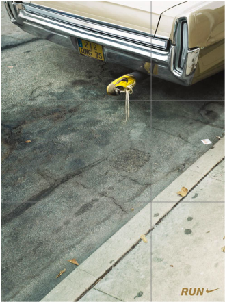
Nike print magazine ad. See how the key elements are placed avoiding the center?
As in photography, composition establishes the relations between objects. It also establishes the relation between the product or the service you promote and the viewer. Using the rule of thirds, for example, you can find out what part of the ad the viewer will see first. Divide the image into thirds both vertically and horizontally, by drawing two vertical lines and two horizontal lines.
The rules of thirds says that the intersections of these lines are the part of the image the viewer will see first. So you have four points where the viewer's eye will land naturally. Take advantage of them and place the most important part of your ad there.
Working with perspectives and proportions, you can use this visual technique for advertising to control how the viewer will perceive an object. You can also influence the buyer using the gaze of people in the ad.
For example, if people are looking at an object in a visual ad, the buyer will understand that the object is offered and will remember the product. If people are looking directly into the buyer's eyes, the buyer will feel the demanding attitude and will remember the ad in connection with the people in it.
This is usually the case with ads featuring celebrities. You don't identify with them, but you remember what products they love or strongly recommend.
Rings a bell?
Recommended: The Best Native Advertising Platforms Right Now
3. Build Leading Lines
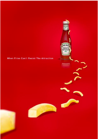
Clever usage of the leading lines technique in Heinz Advertising
People have a natural way of following lines.
It may be due to the fact that we naturally navigate on paths, or perhaps it's all the time we spend driving. Nevertheless, this is precious information in advertising and yet another visual persuasive technique we can add to our list.
By intentionally building lines in an ad, you can guide the viewer to the most important features of the ad. You can draw lines effectively or only suggest them by pointing fingers, people's gaze, colors, object's dimensions etc.
For example, a splash of juice can guide the viewer from a bottle to a fresh orange. The image will be easier to recognize and memorize than an image featuring a bottle of juice and an orange with no visual path between them.
Actually, this is the secret behind so many ads featuring spilling drinks. Cool, right?
READ MORE: These Are the Types of Native Ads You Need to Know
4. Account for Symmetry
 Symmetry and reflection in Maestro Limpio “Reflection” Campaign by Grey Agency. February 2008
The human brain works in patterns. We learn to recognize structures and never disassemble them again.
Symmetry is a powerful tool when creating visual ads. It gives us a sense of order, elegance, and style. We enjoy neat houses, where everything is in place. So we tend to enjoy symmetries in ads and give them more attention. They are easier to remember.
Symmetry also has an emotional side. For example, water reflections evoke nostalgia, and pairs of items make us think of love and family. When you use symmetry, nobody is alone.
Recommended: The 12 Best Native Advertising Examples in 2024 [So Far]
5. White Space (or Negative Space) is your friend
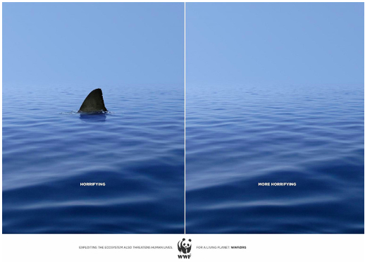
WWF “Shark” Campaign, by DDB Agency. June 2010
Visual ads need to be simple and straightforward. You don't want confused people, asking what the ad is about. In this case, white space is your ally.
White space has many roles. First of all, it keeps the image bright and relaxed. Second of all, it allows the viewer to focus on the product or service you want to sell.
Not least, white space gives the impression of professionalism, good taste, and elegance. In advertising, appearances do matter. Use white space as a visual advertising technique next time you need to direct the consumers eye to something.
Recommended: Best Native Advertising Spy Tools of 2024 [Free & Premium]
6. Work with Repetitions and Patterns
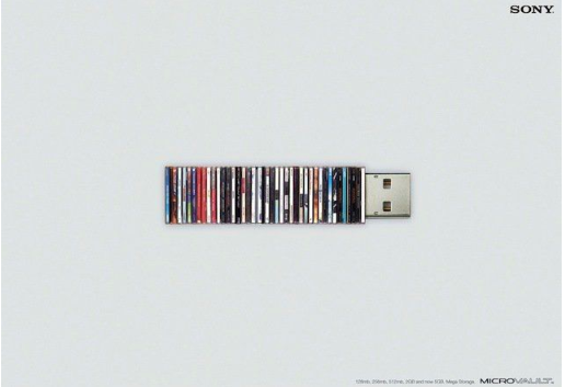
Sony Microvault Ad, November 2005
Repetitions and patterns are used in visual ads to help us remember things. As long as you don't overdo it, the buyer will be easier to convince with a bunch of flowers, rather than by a single flower—or by a forest, rather than by a single tree.
Patterns create strong impressions and strong meaning. We like the idea of group, community, and togetherness. But you can also use patterns and repetitions in a negative role. For example, a single different object in a group of similar objects will suggest independence, creativity, a strong character, a bold attitude, and so on.
7. Consider Juxtaposition

Moms Demand Action For Gun Sense In America, “Kinder Egg” campaign by Grey Agency. July 2013
Juxtaposition is a visual technique of placing elements side by side to create contrast. In juxtaposition, the contrast isn't based just on brightness. It may also be based on color, size, position, social characteristics and many other aspects of life.
Contrast is a very powerful tool in advertising and visual ads. People tend to identify with what they see in an ad. Classic contrasts - such as clean and dirty - have been selling detergents for years.
Juxtaposition is a method to convince people to join a specific category. Like villains and heroes from movies. Think of how you, and your brand, can use juxtaposition as a visual technique in your advertising.
Recommended: 3 Great Examples of Native Advertising on LinkedIn
8. Establish the Focal Point
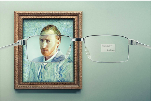
Creative use of the focal point. KelOptics “Impressionism” Campaight by Y&R Agency.
The focal point of an image is the main character of the image, and perhaps the most important visual advertising technique out of all.
In visual ads, more than anywhere else, you need a strong focal point. The entire image is concentrated around it. Using colors, shapes, and leading lines, you build your way to it. You want the viewer to see it and remember it. All the other elements of the ad are there just to highlight it. It is, in fact, the product or service you sell.
Use the focal point strategically in your visual ads to ensure your focus is spot-on.
Conclusion
There has been much research into the area of visual techniques for advertising, and it’s certainly an area of great interest. Every year, The Pantone Color Institute even selects the color forecast in design and advertising, choosing a color of the year.
Visual ads have changed the way people see and understand brands and products. Nothing is as it seems—but is, instead, as you want it to seem. Visual techniques for advertising evolved from their role in photography to a different application.
While the goal of the two applications may be as different as night and day, digging back into the techniques and tenets of photography can help us to create strong visual ads in advertising and these 8 essential visual techniques will never go out of fashion.
