 Details
A catchy native ad can go a long way in attracting clicks. But if it doesn’t send audiences to content worth sticking around on, it’s not going to do much for your awareness, engagement or acquisition goals.
One of the biggest challenges with native advertising is creating content that can capitalise on that initial click. And when most marketers say "content", they're really referring to landing pages.
So, in this article, we'll take a look at some examples of brands and publishers that know how to deliver on landing pages. Perhaps you can incorporate some of these ideas into your native content strategy.
READ MORE: Create good-performing native headlines with these tricks
1. Landing page and native ad combo example from Babbel
A "How To" article is often a good bet when creating content. Is the “how to” headline format overused? Sure, you could say that. But the reason you see it so often is because it works!
The reason “How To” headlines work so well is that they promise to teach you something useful. It’s a formulation that’s hard to resist because it taps into our natural curiosity. But here’s the thing. When someone clicks on a “How To” headline, they expect to actually learn something. The landing page needs to deliver on that promise.
The language learning app Babbel is on the shortlist of brands that truly get native. The below native ad points to a “How To” landing page on Babbel Magazine. Even the choice of the word Magazine instead of Blog is a strategic choice. It fits into what users are already familiar with on publishers' sites, helping to create a higher sense of trust.
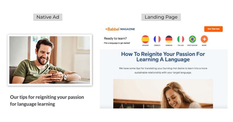
The above example from Babbel demonstrates that native advertising that leads with valuable content and taps into the human desire to learn new things can really bear fruit.
READ MORE: Master visual ads with these unique tricks
2. Landing page and native ad combo example from Lifeboost Coffee
Listicles may have started out as a trend (thanks, Buzzfeed!) but they have long since established themselves as an important tool in the native advertiser’s toolbox.
The top native ad networks recommend using listicles for a reason. Next to "How To" content, lists are one of the most common tactics used in native ads.
Some e-commerce executives shy away from content marketing. A typical argument is that lower-price products easily sell themselves, as they're more "impulse buys." But even if you could make your product free, it would still take effort to “sell” it to customers. Long-form educational content is a great way to inform audiences about a product, regardless of what it costs.
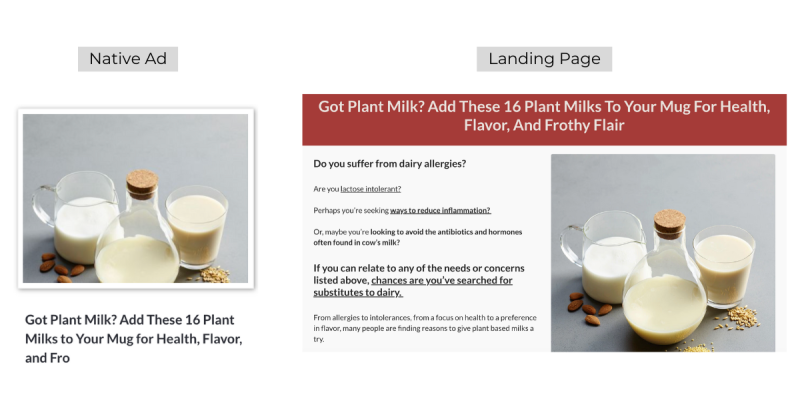
This example from Lifeboost Coffee, a subscription-based healthy coffee brand, demonstrates that listicles can be effective for e-commerce products as well.
3. Landing page and native ad combo example from Tecovas
It's easy to just point users to a product page and hope their "impulse buy mode" kicks in. It might kick in fast on social media, but with native, e-commerce marketers have to work a bit harder.
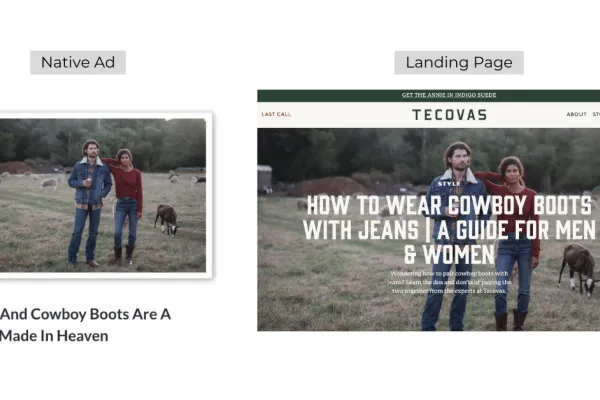
Tecovas, an apparel brand with unique swag, is doing it differently. Instead of simply selling you cowboy boots, it first shows you how to look cool when wearing them with jeans. And c’mon, who doesn’t want to be able to pull off the jeans and boots look?
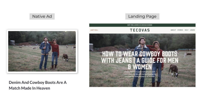
The aesthetics and alluring headline of the native ad lead users to a great article that rivals what you’d find from any fashion-focused publisher or blog. An article with style!
Through long-form educational content, the brand is able to build trust with the readers and earn the right, so to speak, to present its solution: a collection of beautiful cowboy boots.
READ MORE: Learn how to create the perfect advertorial
4. Landing page and native ad combo example from Tripadvisor
You probably already know people aren't mainly browsing publishers' sites to purchase something. They’re typically looking to discover interesting content.
For those who love to travel, reading or viewing something that sparks their wanderlust is often more interesting than just searching for the best deal on ticket prices.
With this ad and article combo, Tripadvisor truly lives up to its name, advising readers who might want to plan a trip to Singapore and are curious about the upcoming events in the country.
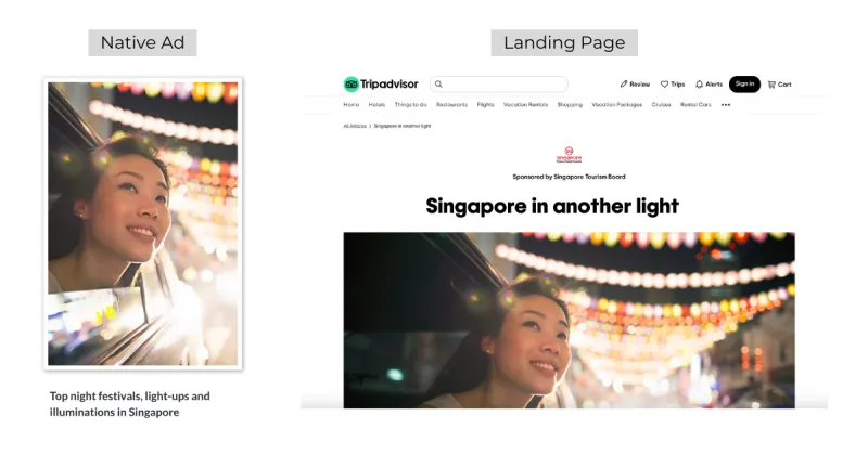
It's common for travel aggregators to just promote low-price trips and easy bookings. But some, as shown in this example, go beyond reaching audiences who are ready to buy. Bring audiences in when they’re still exploring ideas and looking for inspiration. Leave your purchase-focused advertising for your search spend!
After all, how do you get people interested in visiting a country in the first place? Just wait for when they're ready and let search engines take all the credit? No way! You need to pique their interest and everything about this combo – from the inviting photo to the informative sponsored article – does just that.
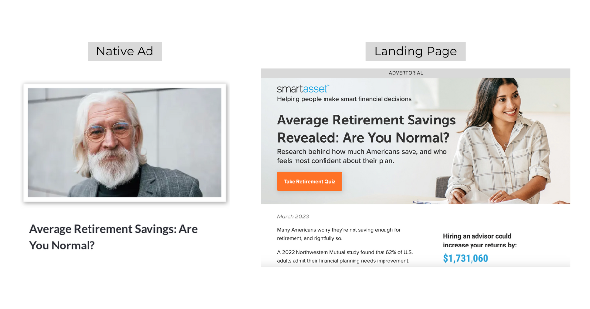
5. Landing page and native ad combo example from SmartAsset
Who doesn't like a good quiz? Especially when you're asked a provocative question.
Seeing the below native ad from SmartAsset, the reader thinks: "Well, yeah, I want to know if I'm normal."
Quizzes are a popular format for native ads. Most people want to know more about their particular situation. A good quiz feels personal and gives audiences the answers they want and need, which is a great way to build trust. It’s also a chance for users to show how smart they are – and we all like that feeling.
Building trust is one of the most difficult tasks with any advertising. Few manage to do this successfully with a creative twist. The financial technology company SmartAsset is one of them and this smart use of a retirement quiz shows why.
For advertisers with lead generation goals, the quiz landing page can be a good alternative to the typical free report lead magnet we're used to seeing on social media ads.
READ MORE: 10 examples of native advertising from Buzzfeed
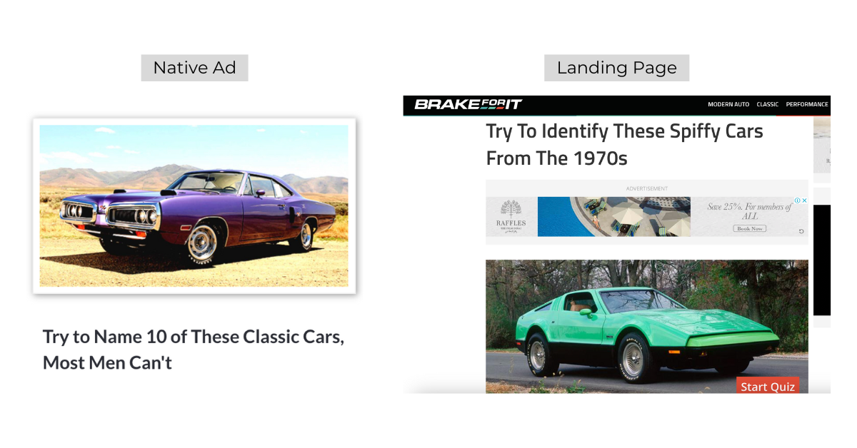
6. Landing page and native ad combo example from Brake For It
For publishers, engagement is currency. The more time users spend on your site, the higher the chances of monetising your content.
Brake For It, a publisher in the auto industry, takes the quiz offer to the next level with its car-identifying slideshow. The ad leading readers there is also incredibly effective – you can almost hear the car-happy male reader say: “Most men can’t, huh? Well, I’ll show you!” Hats off to Brake For It for the creativity behind this ad and landing page combo.
As you go through the quiz itself, you feel like a kid playing a game. It's fun and rewarding at the same time.
This example shows us that entertainment is often the best way to keep users engaged on your site and maximize your chances of hitting those revenue goals.
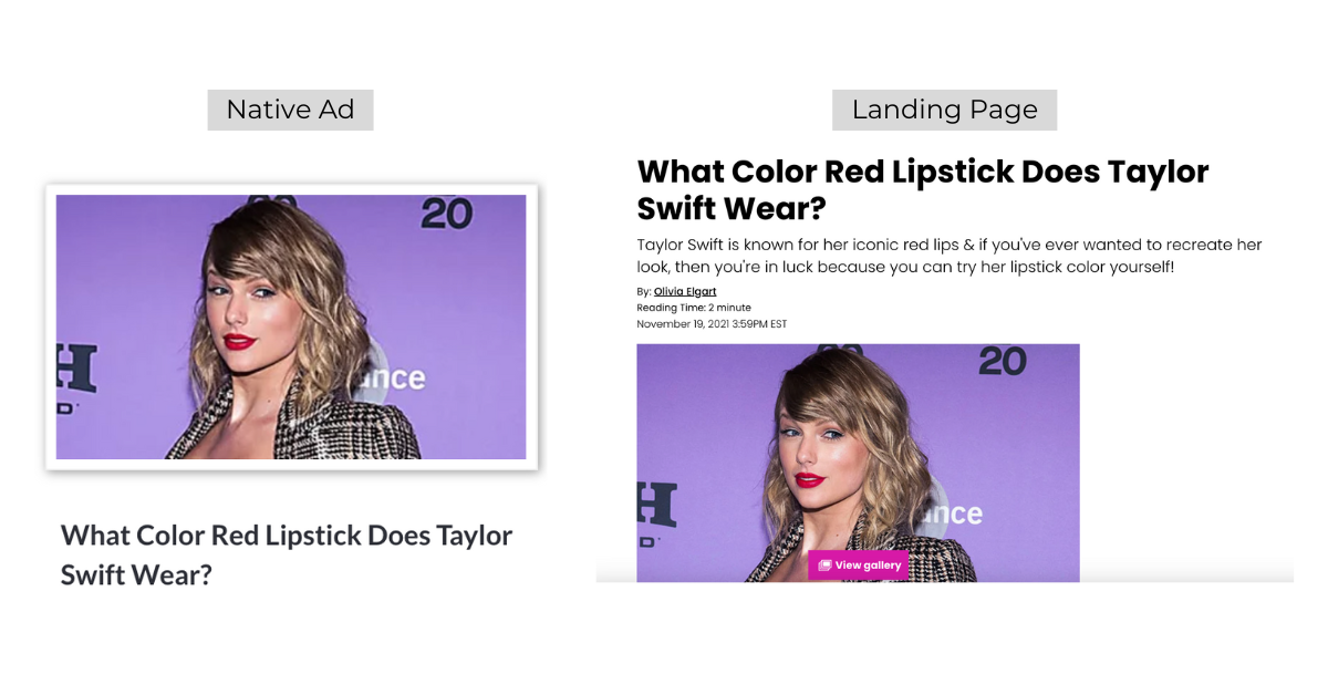
7. Landing page and native ad combo example from Hollywood Life
Celebrities are like magnets. With very little effort, they're able to attract the attention and admiration of thousands, even millions.
Many of us are interested in the lives of celebrities. Perhaps a bit too interested – but that’s a topic for another day.
In the example below, the publisher Hollywood Life not only grabs your immediate attention with its celebrity-featuring ad, but it also keeps it by utilising an almost forgotten engagement tactic - the photo gallery.
If you click on "View gallery", it takes you to a long-form article showing a series of Taylor Swift's moments and looks over the years. That’ll keep the Swifties engaged!
Entertainment and curiosity are mixed together to create the perfect recipe for genuine engagement from native advertisements.
READ MORE: How to do native advertising on social media with success
Main takeaway from these examples
Many brands and publishers launch campaigns without considering native best practices. One of those is to avoid replicating the landing pages you’d use on other channels like search or social.
Try to always work backwards before you launch any native campaign. Work out the offer, the content and finally the ads, which is the easiest part after creating the first two.
You can see that all of these examples have content marketing at the centre of their strategy. Content that is valuable, informative and entertaining.
