Want to know what successful native ad creatives look like?
Here are some key pointers to consider before choosing your ad visuals. These will apply to any native recommendation platforms, such as Outbrain, Taboola, Yahoo, Revcontent or MGID.
Coming up with ad creatives that contribute to business growth is easier than you might think. Let me prove it.
RELATED: Get started with native advertising with our ultimate guide!
1. Make Your Ads Make Sense
As I wrote in my guide to how to write native ad headlines that will boost performance, great copywriting by itself can sell almost anything.
But these days, it takes a bit more than words. Imagery is an incredibly important added variable. When creating ads for native recommendation platforms, the visual plays an essential role. Its job is to make the ad make more sense.
A strong native ad creative, whether that be image or video, is directly associated with your headlines. This is what’s known as ad congruence.
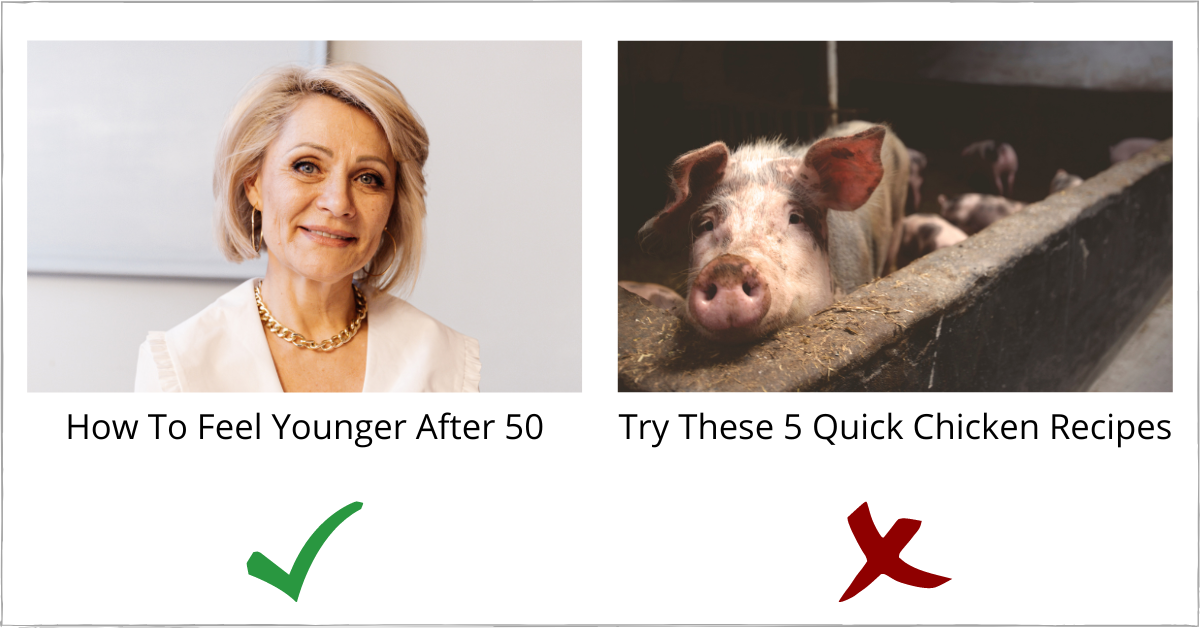
In short, ad congruence is achieved when the headline and image share the same concept or idea. Although it sounds simple, it is often misunderstood and very few advertisers fully grasp it.
Here's a good (left) and bad (right) example.

Unlike other channels such as display or social media, native ads use more simple imagery, which makes it easier to maintain the all-important ad congruence. We’ll look at this again at the end.
For now, let's follow some key creative ads best practices.
RELATED: Visual ads masterclass – learn how to create visual ads with these techniques
2. Avoid Image Overlays
Many native advertising mistakes can be easily avoided. This is one of them.
Social media advertisers who transition to native often use a “copy and paste” approach to their creatives. Most fail to understand that these channels are very different.
Graphics and image overlays may perform well on social media and display. But that doesn't mean you'll get the same results on native. In most cases, you won't.

When people see images with text on their favourite website, they will immediately associate it with advertising and simply ignore it. Remember that your goal as a native advertiser is to create ads that match the look and feel of the content surrounding it.
3. Test Close-Up Shots
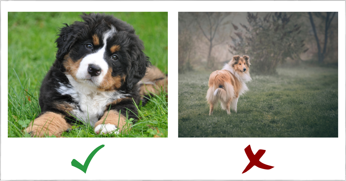
Close-up images tend to outperform far-away shots on native placements. This is because they do a better job at grabbing attention.
One reason is that they reveal more details about the photo and occupy more space in the image frame. Another big benefit of close-up shots is emotional connection.
Pro tip: try to use images in which the subject is directly looking at the user.

Looking at the image on the left, I feel like hugging that puppy and giving it some love. It sparks an emotion in me. This is the effect you want the close-ups to have on your audience.
The image on the right, on the other hand, feels vague, distant and somewhat empty. That’s exactly what viewers will feel when seeing it, increasing their chances of ignoring it.
RELATED: Get started with native ads on TikTok with our guide
4. Use Lifestyle Images
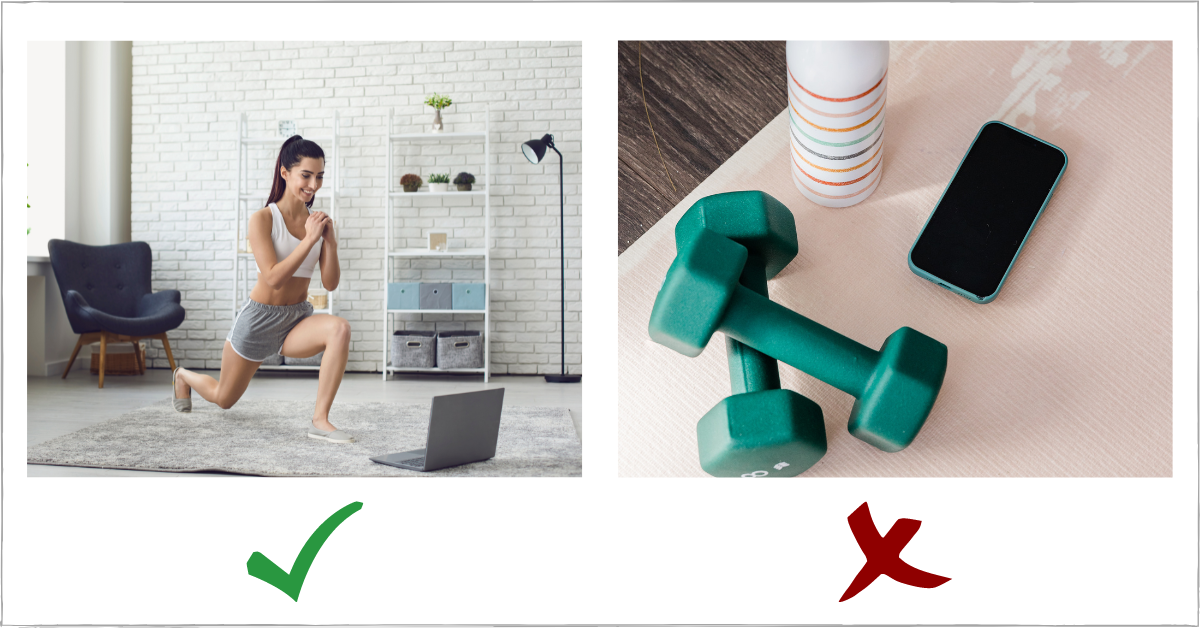
A lifestyle image represents the day-to-day of your audience. They are typically more effective at getting clicks.
Furthermore, winning lifestyle images will, in most cases, have people.
In his book, Making Ads Pay, advertising legend John Caples says: “People are interested in people. Therefore pictures of people are among the best attention getters.”

Images can also work well just by showing the product. It's a common strategy with native ads for e-commerce, though I wouldn't recommend it as a starting point.
If you insist on showing your product, you should always use images of people using it.
Bonus: The 3:2:1 Testing Method
This is a method I've developed over the years for creative testing that I'd like to share with you. It's so simple you'll wonder why you haven’t used it before.
The main idea is to test proven elements with unproven ones. Here’s how it works.
Ideally, in each native campaign, you’ll be testing three headlines paired with two creatives, or vice-versa. That will give you six variations, which seems to be the sweet spot for most platforms.
Once you launch the campaign with six ad variations, wait at least 7 days and pause the underperforming ads, leaving only the top two.
You’ll then take the best-performing headlines from the top two ads and test them with three new creatives on another campaign, with a smaller budget. At the same time, you take the two best-performing creatives and pair them with three new headlines.
The only exception to this would be when the top two ads from the initial campaign have either the same headline or creative. In which case, it would be a 1:3 split.
Each successful test campaign will become the main campaign you can scale. Rinse and repeat!
Native Ad Creatives: Putting It All Together
Now that you know how to craft great headlines and choose attention-grabbing images, it’s time to put your winning native ad together.
We’ve touched briefly on ad congruence earlier. This should always be in the back of your mind when creating any advertisement.
Make sure the ad creative is an extension of the headline so that they share the same idea.
A headline that reads “How To Feel Younger After 50” with an image of a fit 20-year-old lacks congruence. A drastic example, perhaps, but one that drives home the point.
After ad congruence, the amount of testing you do will be the determining success factor on native platforms. The more dirt you mine, the higher your chances of striking gold.
Also, these are simply best practices or pointers. Be sure to do your own testing to determine what works best for your particular business.
And remember - ABT: Always Be Testing. That should become your mantra.
 By
By 
