 By
By Brands that create compelling content are no longer the exception but rather the new rule. With so many companies trying to attract audiences with their content, it’s becoming difficult to stand out.
Packaging your content in a unique format can help it rise above the noise. At Fractl, we’ve seen firsthand how innovative content formats can give you a competitive edge by engaging audiences bored by the same old content while also enticing publishers looking for novel ways of presenting information.
If you’re looking to differentiate your content, stand out among the competition, and attract more attention, here are some innovative content formats to consider adding to your content production process.
The top innovative content formats for 2024
Data Journalism
One of the best ways to create compelling, innovative content is to base it on new data. Data journalism takes an investigative approach by combing through data to find an interesting story or reposition an old story in a new way. Using data for content marketing attracts the attention of publishers who are often interested in sharing original research and new insights with their audiences.
Example of data journalism: The Most Instagrammed Locations
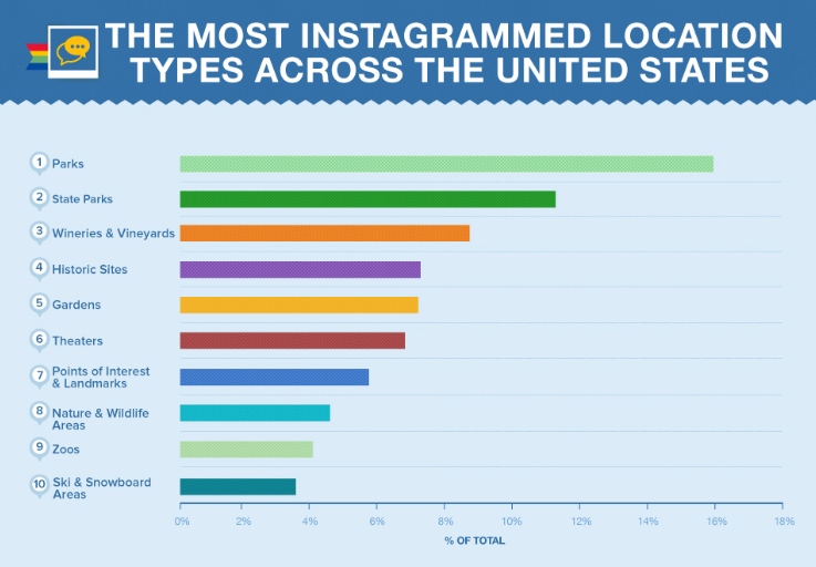
Our team used information from Instagram’s public API to find data on popular Instagram locations around the country. We compiled the results into a report, “The Most Instagrammed Locations,” which caught the attention of readers who shared it more than 36,000 times. Time, AOL, Yahoo, USA Today, and Business Insider were among the 330 websites that covered this data journalism campaign.
Related: The top 10 examples of BuzzFeed doing native advertising
Infographics
Just as audiences and publishers like seeing data compiled into interesting reports, they also like easy-to-digest content formats. Infographics are so popular because they break down otherwise overwhelming data into digestible icons, graphics, and charts, making this format well-received by busy digital media audiences who want content that gets straight to the point.
Example of infographic: America’s Favorite Dog
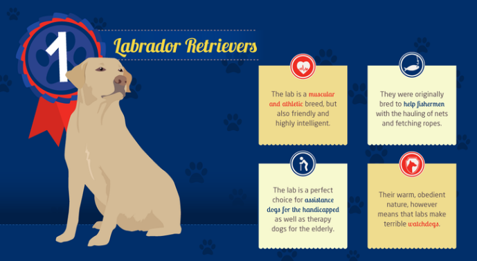
When we put together an infographic for the campaign “America’s Favorite Dog,” we made it easy to see how dog breed popularity trended across the country. The story proved popular among dog lovers, which led to more than 21,000 social shares and 100-plus website features on sites including Mashable and Mental Floss.
READ MORE: The Best Native Advertising Platforms Right Now
State Maps
Audiences like to see themselves represented in data and visual storytelling, so state maps or regional maps that include data on every state/region in the country are often good ways to catch mass attention by evoking regional pride and interest.
Example of state map: America’s Drinking Habits
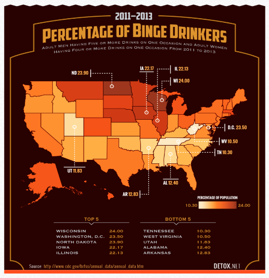
We produced a map that showed the percentage of binge drinkers throughout the United States, and it garnered attention across the country. It was featured on over 600 websites including The Daily Beast, BroBible, The Huffington Post, USA Today, Vanity Fair, Bustle, and Uproxx, and it received over 122,000 social shares.
READ MORE: How to Create the Best Visual Ads with these Visual Techniques
Parallax
Parallax is another innovative content format and by using the technique of scrolling parallax web design, you can create a unique interactive experience that combines interesting data and engaging design to immerse the audience into the story.
Example of parallax: Drug Bless America

A Fractl parallax project called “Drug Bless America” takes viewers on a journey through the country’s complicated relationship with illicit drugs. Instead of overwhelming viewers with all of the information up front, viewers are presented with different sides of the story as they scroll.
GIFs
GIFs, which are animated images that can be shared and embedded as easily as JPEGs, are also a popular digital content format. Audiences and publishers still love them because they are both engaging and easy to share.
Example of GIF: College Enrollment
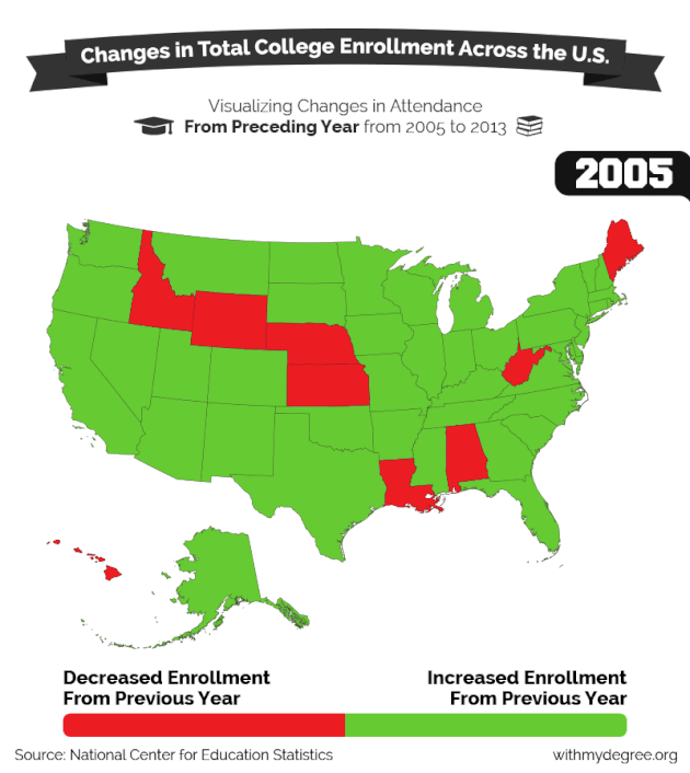
We created GIFs to support our story on college enrollment numbers, and our images were featured on more than 60 websites including Yahoo, Mashable, MTV, The Nerdist, and Mental Floss.
READ MORE: How Much Does Native Advertising Really Cost?
Morphing GIFs
Morphing GIFs is more innovative approach to the tradtional GIF content format. They feature a smooth transition between images, and are also favorites among both readers and publishers.
Example of morphing GIF: The Evolution of Miss America
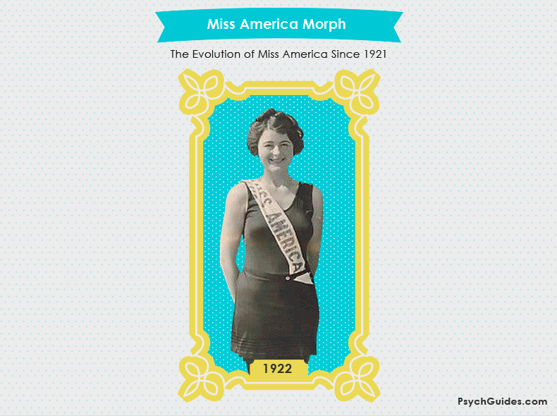
We created a morphing GIF (see the full morph here) that showed the evolution of Miss America since 1921 – it caught the attention of readers to the tune of more than 22,000 social shares. Publishers were also drawn to the graphic, and it was published on over 750 sites including The Huffington Post, BuzzFeed, Glamour, Seventeen, Women’s Health, Vanity Fair, Business Insider, and MSN.
Illustrations
Images don’t need to move to be popular among audiences. Static illustrations are also effective at catching attention and getting shared across the internet – especially when they are tied to a trending issue and emotional topic.
Example of illustration: Reverse Photoshopping
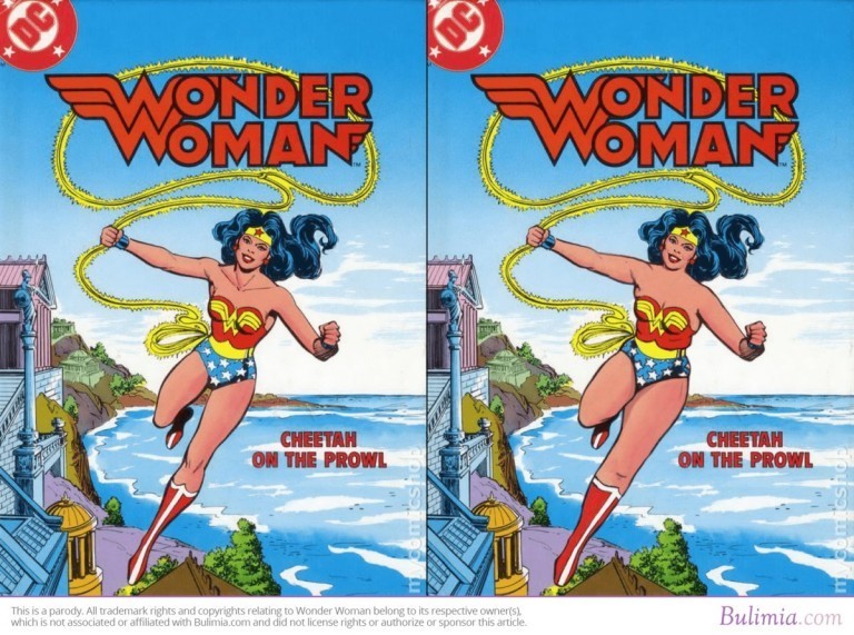
The illustrations in our “Reverse Photoshopping Comic Covers” campaign depicted comic book characters who were photoshopped to look more like an average body type. The series of images spread online quickly and was featured on The Huffington Post, Today, MSN, Playboy, Newsweek, and more than 1,200 other websites. The story was also shared more than 105,000 times on social media.
READ MORE: What Are in-feed Native Ads?
Image Sliders
Online audiences are attracted to content that shows strong contrast, which is why image sliders make a compelling visual format. Image sliders feature two images side-by-side. The images are similar but show some kind of before-and-after, and the user can control which image they see by sliding the center line to see the full depiction of either image.
Example of image slider: Urban Rehabilitation

A popular Fractl campaign featured an image slider that showed Google Street views of urban areas from 2007 to 2011 to put urban rehabilitation in context. The images received more than 2,500 social shares and appeared in over 80 featured stories from Daily Mail to Search Engine Land.
Interactive Infographics
Image sliders are appealing to audiences because the user can engage with the content and control their experience. This is the same reason why interactive infographics are so popular. With these, the audience can control what information they see and personalize their experience.
Example of interactive infographic: Twitter Reading Levels
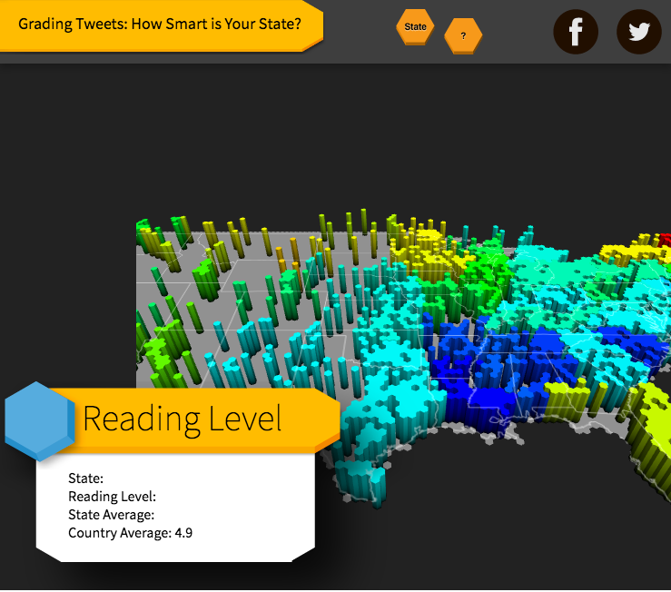
We created this interactive infographic that enabled audiences to click on a location to see their state’s reading level based on tweeting activity. The popular interactive chart was picked up by Yahoo, People, Daily Mail, and 240-plus other sites and received more than 13,800 social shares.
Node Diagrams
Complicated data are much easier to digest and understand when delivered through visuals. They are simplified even more when the user can control the data to dig deeper into the areas that interest them. Interactive node diagrams enable audiences to do this by layering big data. They give users the ability to separate and break up the data, and then put them back together to see how they are all connected.
Example of node diagram: Influencer Networks Among Twitter Users
Our team used an interactive node diagram to explain the complex relationships among Twitter influencers. By showing the data as a whole and also allowing the audience to break down the chart into smaller parts, we were able to clearly explain a complex set of data. The campaign was featured on leading marketing and business sites, including Harvard Business Review and Moz.
Custom Apps
Audiences like to connect with their content and make it a personal experience. So creating custom apps that generate outcomes based on user interaction is an effective way to create innovative content that will be shared and spread across the internet.
Example of custom app: Your Face as an Alcoholic
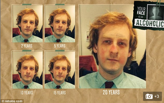
We created a custom app that prompted users to upload their photo so they could see what their face looked like as an alcoholic. Users enjoyed the interactivity of the app and shared it over 14,000 times. It was also featured in over 750 articles from Daily Mail and The Huffington Post to Cosmopolitan, BBC, and Medical Daily.
Calculators
Another way to give control over content to your audience while providing immense value is through a custom calculator. An online calculator is an app that uses a custom formula to take user input and convert it into useful data.
Example of calculator: Sexual Exposure Calculator
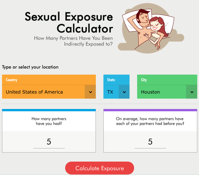
We created a calculator with a formula that derived a person’s sexual exposure based on the number of partners they had, the number of partners their partner had, and where the encounters took place. The fun and educational tool received 11,000-plus social shares and was published on over 150 websites including Esquire, The Huffington Post, Elite Daily, Cosmopolitan, and Playboy.
READ MORE: What is Native Advertising? Explore our Ultimate Guide
Videos
Video is one of the fastest growing media formats online, so this content format needs to be in your arsenal of online content. Plus, videos are easy to share on sites like YouTube and Facebook, giving you a new way to promote your content and find new audiences.
Example of video: eBay Makes Christmas Wishes Come True
We crafted an emotionally compelling video around the holidays to generate and encourage sharing. The “eBay Makes Christmas Wishes Come True” campaign resulted in more than 11,000 views on YouTube.
Scribe Videos
Emotionally driven videos do well online and so do informative, educational videos – especially when they are fun to watch. Scribe videos use markerboard drawings to share information in a way that audiences find engaging and interesting.
Example of scribe video: Language and Spending
Audiences and publishers alike thought our scribe video dubbed “Language and Spending” was worth sharing. It received over 34,000 social shares and was featured on 40-plus websites including The Huffington Post, The Atlantic, PBS, and Upworthy.
On-Site Content
Sometimes turning average on-site content into amazing on-site content is as simple as formatting and presenting the information in a new way. You can turn on-site content like guides and tutorials into useful and engaging pages that keep audiences on your site longer and are more likely to convert readers into buyers.
Example of on-site content: NFL Fanatics Jersey Buying Guide
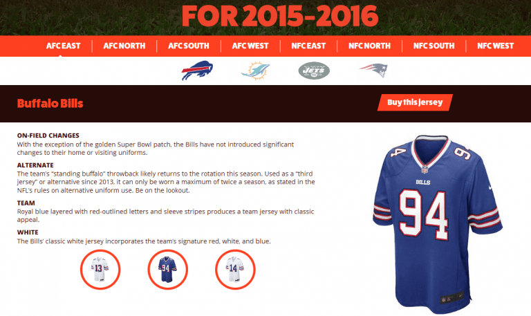
Instead of promoting football attire through ordinary product descriptions and sales pages, we created an NFL Jersey Buying Guide where users could easily find information to help them with their purchasing decisions while making the shopping experience fun.
Landing Pages
The same rule that applies to on-site content applies to landing pages. You can turn an ordinary page of content into an upgraded version by adding extra features and usability. Plus, when you present useful, valuable, and emotionally driven information in a unique and engaging way, you can increase the number of links that point back to these interesting pages on your website.
Example of landing page: Perceptions of Perfection Across Borders
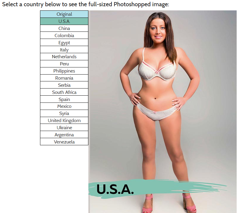
We created a landing page that featured images of the same women photoshopped in 18 different countries. The landing page, which featured emotionally charged data presented in simple way, spread like fire around the internet. It was picked up by nearly 600 websites including BuzzFeed, The Huffington Post, The New York Times, Mashable, Yahoo, and E! Online. The landing page itself received more than 900,000 social shares and came in just shy of 700,000 page views.
With so much content floating around online, you can’t expect to make an impact with ordinary content. You need to use innovative content formats to tell unique and interesting stories to engage readers, receive coverage from publishers, and get the highest return on your content marketing efforts.
The post 16 Innovative Content Formats That Audiences and Publishers Love appeared first on Fractl.
Photo: William Iven, Unsplash
Want more? Sign up for the Native Advertising Institute Newsletter and get weekly insights and news from the people who live and breath native advertising.


